British Red Cross: Donor Sign Up for Web
I worked with the British Red Cross digital retail team, alongside internal software developers and architects, to design a donor sign-up form for web. The project was delivered on a short timeline and needed to balance accessibility, strong brand alignment and ease of use at a critical moment in the donation journey.
The form supports donors signing up either at home or quickly in a British Red Cross shop immediately before making a donation, so clarity and speed were essential.
The Challenge
The form was being built as a standalone experience, separate from the main British Red Cross website. This meant:
- All persuasion and encouragement to sign up had already happened elsewhere
- The form needed to feel instantly familiar and trustworthy
- Users needed to complete it quickly, often on mobile and sometimes in-store
There were also technical considerations around how donor data would integrate into the existing till system, as well as how donors would be communicated with once sign-up was complete.
Design Approach
I designed the experience mobile-first, ensuring the form worked seamlessly across devices and contexts.
Key decisions included:
- Reducing friction by limiting non-essential fields and removing unnecessary marketing content
- Clear, plain language to make the form easy to understand and complete quickly
- Accessibility-first thinking, ensuring the form met accessibility standards and worked well for all users
- Strong brand alignment, matching the existing British Red Cross donation UI for one-off and monthly donations to build trust and consistency
Because the form lived outside the main site, I intentionally avoided repeating messaging that users had already seen, keeping the focus purely on completion.
Iteration & Collaboration
The design was iterated based on feedback from the British Red Cross digital retail team, as well as technical input from developers and architects. Changes focused on improving clarity, reducing cognitive load, and ensuring the design could be implemented cleanly within existing systems.
Once refined, the form was signed off by the digital retail team and prepared for deployment.
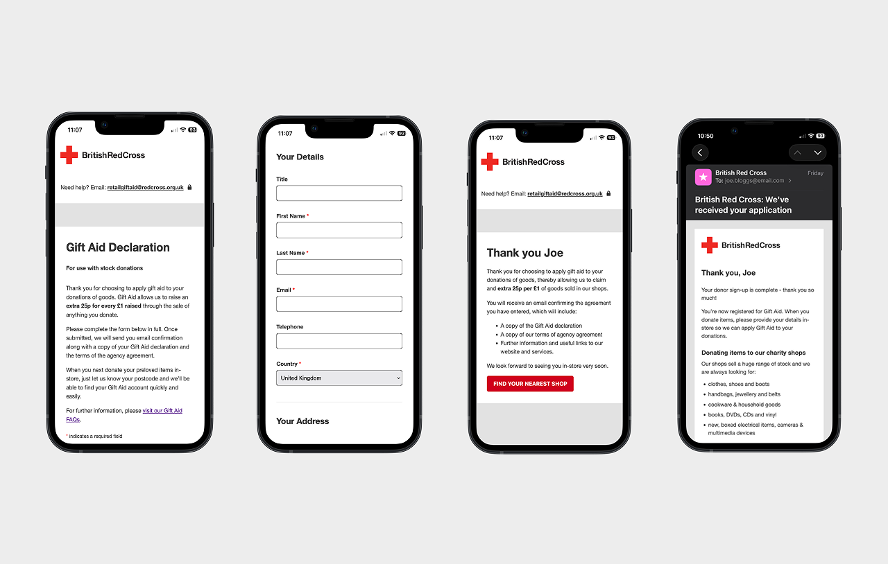
Confirmation & Communication
Beyond the form itself, I considered the full sign-up flow:
- On-page confirmation clearly notifies the donor that sign-up is complete
- I proposed adding a direct link to the ‘Find a store’ page, helping donors immediately locate their nearest shop
- The confirmation experience also includes guidance on what goods can currently be accepted in stores
- A follow-up email reinforces the thank-you message and repeats the key links, ensuring donors have everything they need even if they leave the page quickly
Outcome
The final solution is a focused, accessible, and brand-consistent sign-up experience that supports donors at a key moment in their journey. By stripping the experience back to essentials and designing mobile-first, the form reduces friction and supports fast completion in both home and in-store contexts.